

How I Led Nexus Community Partners Through a Full Email Redesign and Template Architecture Process
A process-forward engagement — walking a Minneapolis-based nonprofit through brand discovery, creative direction, and the design and build of a modular email template system for Black Giving Day and year-end fundraising.
4
Week build — discovery through handoff
Introduction:
Nexus Community Partners is a Minneapolis-based nonprofit dedicated to community wealth building and cooperative ownership — working to ensure that the communities most impacted by economic inequality have the power and resources to own and shape their own futures.
When Nexus came to us, they had an upcoming fundraising season — Black Giving Day in August and year-end giving in November and December — and a newsletter program that needed a visual refresh. What they needed wasn't just templates. They needed a thoughtful design process that would produce modular, reusable assets their internal comms team could operate independently long after delivery.
4
Core deliverables — email templates, newsletter redesign, asset library
Background:
Nexus had a documented brand system — an established color palette, typography, and visual identity — but their donor-facing email communications weren't fully leveraging it. Fundraising emails in particular needed to feel elevated, emotionally resonant, and visually distinct from their standard newsletter sends.
The challenge was twofold: design fundraising email templates that could carry the weight of a major giving campaign, and redesign the newsletter to create a consistent, polished look-and-feel their team could sustain week to week. Both needed to live in Mailchimp and be built for a non-designer to operate.
3
Distinct creative directions developed for client selection
The process — how we worked
Discovery & brand voice audit
We began with a deep dive into Nexus's existing brand system — reviewing their documented guidelines, past email sends, and the visual language their community had come to recognize. This wasn't about starting from scratch; it was about understanding what already existed and identifying where the donor-facing communications had room to grow. We mapped the gap between their standard brand system and what a high-performing fundraising email needed to feel like.
Template architecture planning
Before a single design was built, we mapped the architecture. What sections does each template need? In what order? What needs to be fixed versus flexible? For the fundraising templates, that meant defining the hero, the story section, the impact block, the CTA, and the footer — and deciding which of those would be locked and which the Nexus team could swap out per send. For the newsletter, it meant building a modular system with interchangeable content blocks. This planning phase is what separates a template used once from a long-term asset.
Creative direction — three style concepts
Rather than presenting a single design direction and asking for approval, we developed three distinct creative concepts for the fundraising emails — each representing a different visual and emotional approach. The goal was to give the Nexus team real creative agency: a meaningful choice that would shape how their donors experienced the campaign.
Client review & Figma walkthrough
All concepts were presented in Figma — giving the client a live, visual preview of each direction before anything was built in Mailchimp. We walked Karen and Jamie through each option, explained the design rationale behind every decision, and created space for feedback and questions. This is where the real collaboration happens. The Figma board also served as a shared reference point throughout the build phase — a single source of truth that kept everyone aligned.
Build, QA & Mailchimp delivery
With a creative direction selected, we moved into build — translating the approved Figma designs into fully functional Mailchimp templates, complete with modular content blocks, correct brand typography, and mobile-responsive layouts. Every template went through a QA pass before handoff: tested across email clients, reviewed for rendering consistency, and documented with a walkthrough guide so the Nexus team could operate the templates confidently from day one.
Asset library handoff
The final deliverable was a reusable graphic asset library — a set of designed graphics, banners, and visual elements that Nexus's internal team could pull from for future emails, social posts, and campaign materials. The goal was to leave the organization more capable than we found them: not dependent on external design support for every send, but equipped with a system they could sustain and build on independently.
Visual process — Figma board
Design decisions in fundraising communications aren't just aesthetic — they're strategic. The color that makes someone feel urgency, the typography that signals trust, the layout that guides the eye to the ask — every choice either moves a donor forward or creates friction. Getting those decisions right requires more than good taste. It requires a process.
For Nexus, that process lived in Figma. Before anything was built in Mailchimp, every concept was mapped out visually and shared with the client as a living, interactive board — not a static PDF, not a screenshot. The goal was to give the experience of being inside the design before committing to a direction.
Presenting multiple creative concepts isn't about offering options for the sake of options. It's about surfacing the emotional register the client actually wants their donors to feel. Should this email feel like a movement? An invitation? A moment of gravity? Each direction answers that question differently, and the right answer isn't something a designer decides alone. It comes from the conversation the Figma board makes possible.
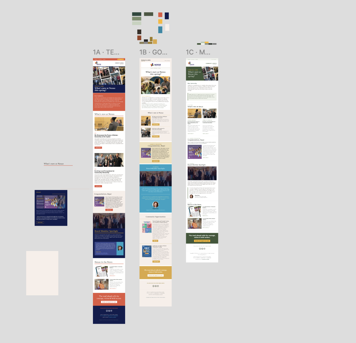
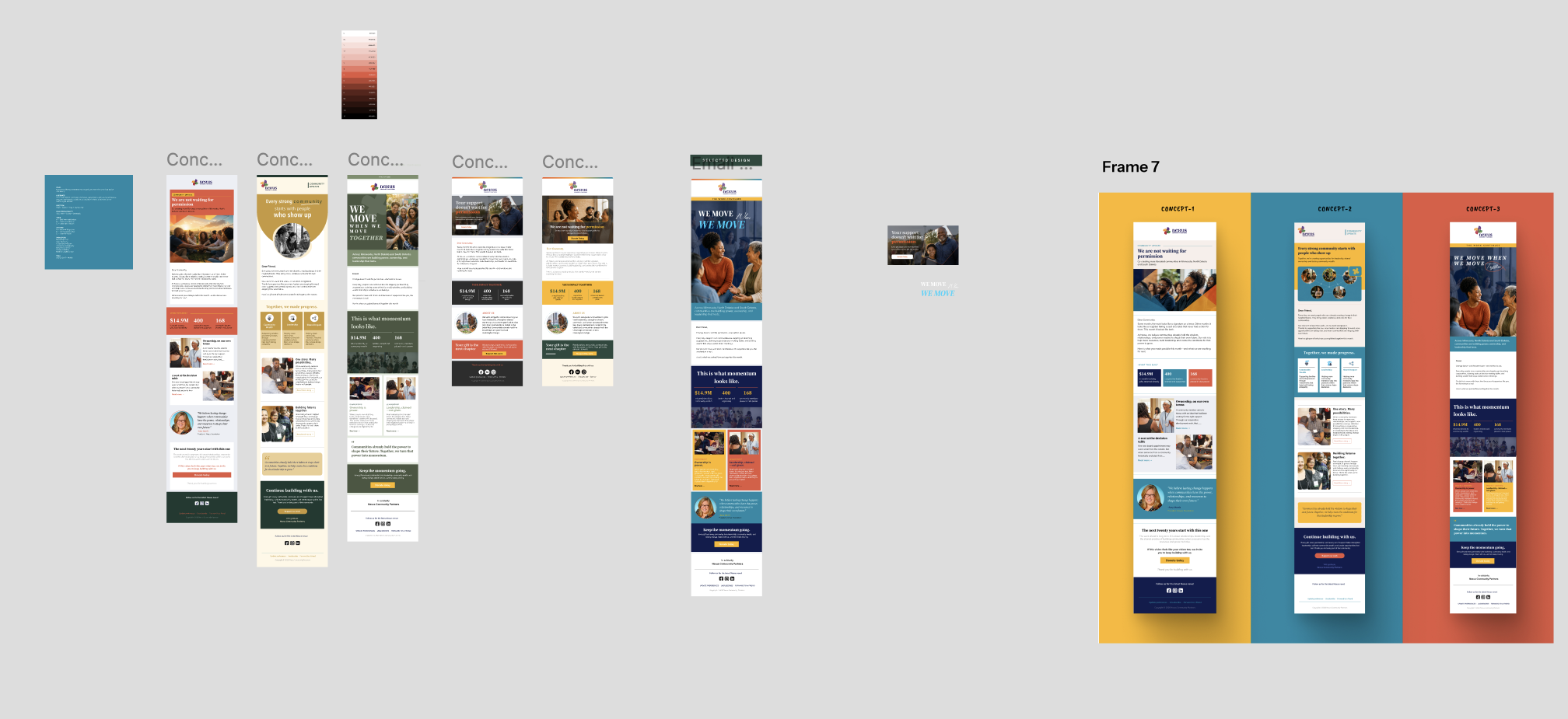
That collaborative review, where the client can point, react, question, and redirect in real time, is where the most important alignment happens. By the time build begins, there are no surprises. The template that lands in Mailchimp is the one everyone agreed to, understood, and believed in.
Deliverables
Black Giving Day Template
Fundraising emails built in Mailchimp — modular, mobile-responsive, single clear ask.
Year-End Giving Template
Campaign emails distinct from the newsletter — designed to drive donor conversion for end-of-year giving.
Newsletter Redesign
Visual refresh with a modular block system their team can operate week to week.
Graphic Asset Library
Reusable branded graphics — headers, banners, and visual components for future campaigns.
No Design Dependency
Templates are built for non-designers—their team operates them independently from day one.
Modular Architecture
Content blocks can be added, removed, or reordered per campaign without breaking the design.
Documented System
Every template comes with a walkthrough guide — no guessing how to use what was built.
Asset Library for Reuse
Designed graphics the team can pull from for future emails, social posts, and materials.
Built to last beyond the contract
Conclusion
The Nexus engagement is a blueprint for how design and brand development work should operate in the nonprofit space. Not a one-time deliverable dropped in an inbox — but a structured, collaborative process that builds organizational capacity and leaves the client with a system they can own and sustain independently.
For organizations facing high-stakes fundraising moments, the work that happens before the email goes out is what determines whether it converts. Discovery, architecture, creative direction, client alignment — that's the infrastructure.